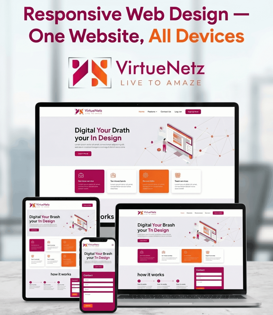
Over 78% of internet users in Pakistan now browse the web on their smartphones. Globally, mobile devices account for more than 60% of all web traffic. If your website is not built with responsive web design, you are actively losing customers every single day — and Google is penalising your rankings on top of it.
Responsive web design is the practice of building websites that automatically adjust their layout, images, and content to fit any screen size — whether it is a 27-inch desktop monitor, a tablet, or a 5-inch smartphone screen. A truly responsive site does not just “shrink” on mobile. It rethinks the entire user experience for every device.
In this complete guide, VirtueNetz breaks down everything you need to know about responsive web design: what it is, how it works technically, why it matters for SEO and conversions, common mistakes to avoid, and how Pakistani businesses can implement it the right way.
The Core Principles of Responsive Web Design
Responsive web design is built on three fundamental technical pillars. Understanding these helps you evaluate whether your current website is truly responsive — or just mobile-tolerant.
1. Fluid Grid Layouts
Traditional websites used fixed pixel widths — for example, a content area set at exactly 960px wide. Fluid grids replace fixed units with proportional ones, typically percentages. A column set to 50% will always be half of whatever screen it sits on, whether that is 320px or 1920px wide.
This proportional approach is the foundation of responsive layouts. It ensures that your page structure flows naturally rather than breaking or overflowing when viewed on a smaller device.
2. Flexible Images and Media
Images are the most common cause of broken mobile layouts. In responsive web design, images are given a max-width of 100%, which means they scale down proportionally to fit their container without ever exceeding it. Modern techniques like the HTML srcset attribute take this further by serving different image sizes to different devices — so a mobile user does not waste bandwidth downloading a 2000px-wide desktop image.
3. CSS Media Queries
Media queries are the engine behind responsive web design. They allow developers to apply different CSS rules based on the device’s screen width, orientation, or resolution. For example, a three-column desktop layout might collapse into a single-column stack on mobile screens below 768px. Media queries make this possible without duplicating code or creating separate mobile websites.
| 💡 Pro Tip: Mobile-First Design The modern approach to responsive design is ‘mobile-first’ — meaning you design for the smallest screen first, then progressively enhance the layout for larger screens. This produces faster, cleaner code and forces you to prioritise the content that actually matters. |
Why Responsive Web Design Directly Impacts Your Google Rankings
Google officially moved to mobile-first indexing in 2019. This means Google primarily crawls and indexes the mobile version of your website, not the desktop version. If your mobile experience is poor, your SEO rankings will suffer — regardless of how well-optimised your desktop site is.
Beyond mobile-first indexing, responsive design also improves your Core Web Vitals scores — Google’s set of page experience metrics that directly influence search rankings. A well-built responsive site loads faster, has less layout shift, and is more interactive — all factors Google rewards with better visibility.
| SEO Factor | Impact of Non-Responsive Site |
| Mobile-First Indexing | Lower rankings for ALL searches, not just mobile |
| Page Load Speed | Slow sites rank lower — mobile pages often 3x slower if not responsive |
| Bounce Rate | Users leave instantly on poor mobile UX, signalling low quality to Google |
| Core Web Vitals | LCP, CLS, INP scores drop — ranking penalties apply |
| Dwell Time | Frustrated mobile users leave faster, hurting rankings indirectly |
If you want to understand the full relationship between design and search performance, our article on web design and SEO strategies covers this in detail. You can also explore how website speed optimisation ties directly into responsive performance gains.
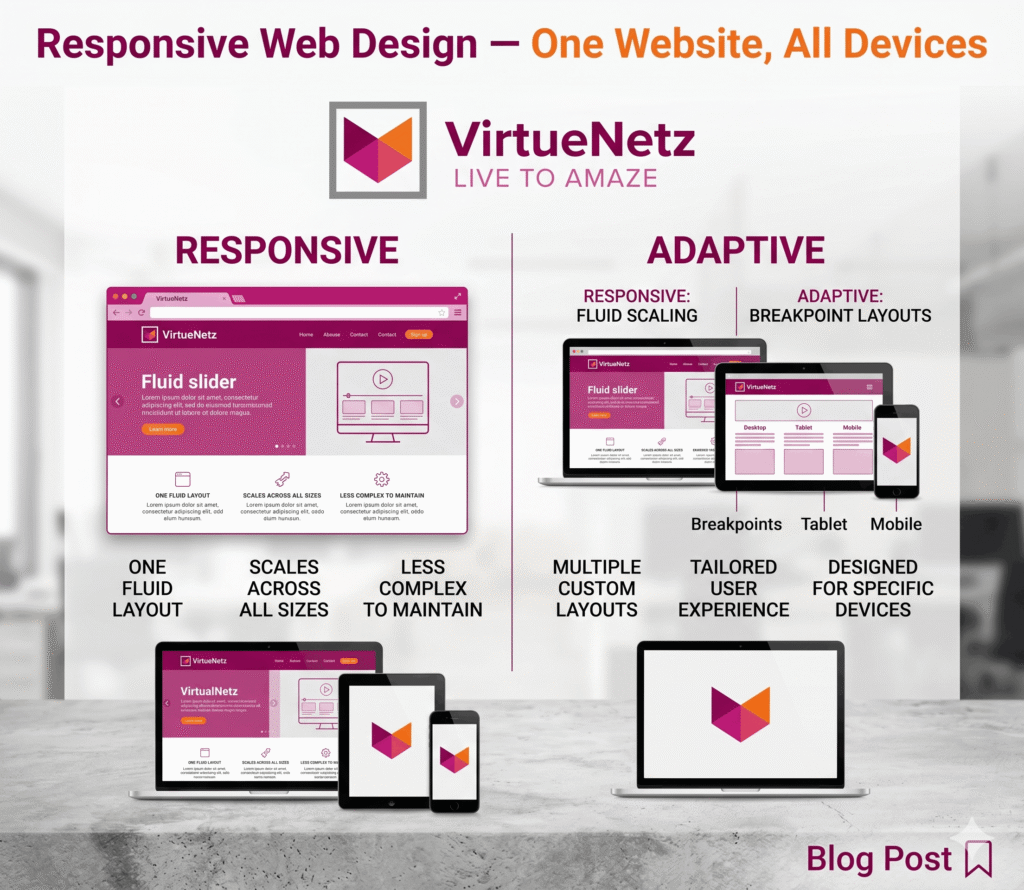
Responsive Web Design vs Adaptive Design: What Is the Difference?
These two terms are often confused. Both aim to deliver a good experience across devices, but they take fundamentally different approaches.
| Feature | Responsive Design |
| Layout approach | Fluid — content adjusts smoothly to any screen width |
| Breakpoints | Flexible — adapts at any width, not just predefined sizes |
| Code base | Single codebase serves all devices |
| Development cost | More efficient — one design to maintain |
| SEO benefit | Preferred by Google — single URL, no content duplication |
| User experience | Seamless transition across all screen sizes |
Adaptive design uses multiple fixed layouts — typically six — and detects the device, then serves the matching layout. While this can offer more precise control, it creates code duplication, higher maintenance overhead, and potential SEO issues with duplicate content. For most Pakistani businesses and international clients, responsive design is the smarter, more scalable choice.
Key Elements Every Responsive Website Must Have in 2026
A truly responsive website is more than just a flexible grid. These are the elements that separate a professional responsive design from a basic one:
Mobile-Optimised Navigation
Desktop navigation menus — especially multi-level dropdowns — become unusable on small screens. Responsive navigation typically uses a hamburger menu (three horizontal lines) that expands into a full-screen or slide-in menu on mobile. Touch targets must be at least 48px × 48px to be usable with fingers, not just mouse cursors.
Scalable Typography
Font sizes that look perfect on a 1440px desktop monitor can become unreadably small on a 375px phone. Responsive typography uses relative units like rem and em, and media queries to adjust heading sizes across breakpoints. Google recommends a minimum of 16px for body text on mobile.
Touch-Friendly Interface Elements
Buttons, form fields, and interactive elements need to be sized and spaced for fingers. A clickable element that works fine with a precise mouse cursor becomes frustrating when it is too small to tap accurately. This is especially important for e-commerce websites where poor touch UX directly kills conversions.
Optimised Images for Every Screen
Using a single large image for all devices wastes bandwidth on mobile and slows down your page. Modern responsive design uses the HTML picture element and srcset to serve appropriately sized images — a 400px image on mobile, an 800px image on tablet, a full 1600px image on desktop.
Fast Mobile Load Times
Mobile users are often on cellular networks with variable speeds. A responsive website should aim for a First Contentful Paint (FCP) under 2.5 seconds on mobile. This requires clean code, compressed assets, and smart use of browser caching.
| Navigation | Typography | Touch UX | Images | Speed |
Common Responsive Web Design Mistakes Pakistani Businesses Make
Even well-intentioned websites can suffer from responsive design failures. Here are the most common mistakes we see when auditing websites for Pakistani businesses and international clients:
- Using viewport-blocking elements that prevent pinch-to-zoom — this violates Google’s mobile usability guidelines
- Setting fixed pixel widths on containers instead of percentages or max-width values
- Ignoring touch target sizes — buttons that are too small to tap accurately
- Using hover-dependent interactions that do not translate to touchscreens
- Embedding videos or iframes without making them responsive (fixed width/height attributes)
- Failing to test on real devices — emulators miss real-world performance issues
- Forgetting to optimise forms for mobile — small inputs, poor keyboard triggering
- Keeping the same font sizes across all breakpoints — tiny text on mobile is a top UX complaint
| 💡 Quick Test Open Google Search Console and check the ‘Mobile Usability’ report. Any issues listed there are hurting your rankings right now. Also use Google PageSpeed Insights to test your site’s mobile performance score. |
Responsive Web Design and Ecommerce: Why It Is Critical for Online Stores
For ecommerce websites, responsive design is not just a nice-to-have — it is directly tied to revenue. Research consistently shows that mobile commerce (m-commerce) accounts for over 70% of ecommerce transactions globally. In Pakistan, mobile shopping is growing rapidly, driven by platforms like Daraz, and increasingly by branded online stores.
A poorly responsive ecommerce site creates friction at every stage of the customer journey: products are hard to browse, add-to-cart buttons are difficult to tap, checkout forms are tedious to fill, and payment flows break. Each friction point is a lost sale.
Our team at VirtueNetz specialises in building ecommerce websites that are responsive from the ground up. Whether you need a custom WooCommerce store or a Shopify development solution, we ensure the mobile experience is as strong as the desktop one. You can also review important ecommerce website design features that every store must have.
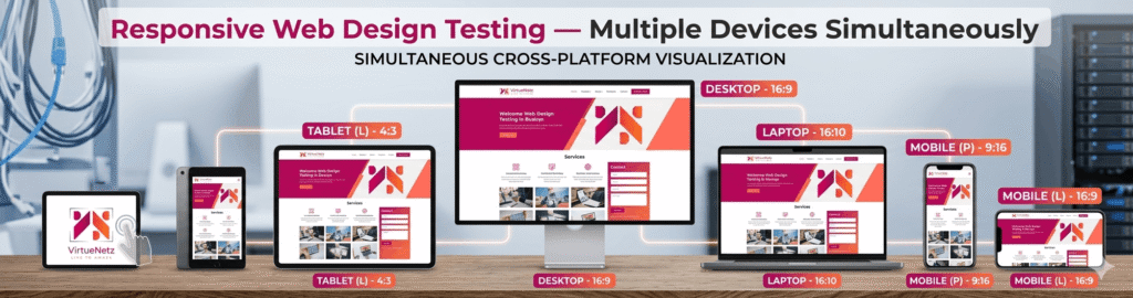
How to Test Whether Your Website Is Truly Responsive
Testing responsive design goes beyond resizing your browser window. Here is a practical checklist for a thorough evaluation:
Google Mobile-Friendly Test
The simplest starting point. Go to search.google.com/test/mobile-friendly, enter your URL, and Google will tell you if your page passes its mobile-friendliness check and flag any specific issues.
Google PageSpeed Insights
Provides a separate score for mobile and desktop performance, along with specific recommendations. Focus on your mobile score — this is what correlates most directly with rankings and user experience.
Chrome DevTools Device Emulation
Right-click in Chrome, select Inspect, then click the device toggle icon. This lets you emulate dozens of device sizes. While it is not a replacement for real-device testing, it is excellent for catching obvious layout issues quickly.
Real Device Testing
Always test on actual physical devices — particularly the most popular smartphone models your audience uses. Emulators miss real-world performance bottlenecks, rendering differences, and touch interaction nuances.
BrowserStack or Responsively App
BrowserStack lets you test across hundreds of real device and browser combinations remotely. Responsively is a free desktop app that shows your site on multiple screen sizes simultaneously, saving significant testing time.
Responsive Web Design for Pakistani Businesses Targeting International Clients
Pakistani businesses — particularly IT companies, freelancers, and digital agencies — frequently target US, UK, and Gulf clients. For this audience, website quality is a strong trust signal. A non-responsive or poorly performing website will hurt your credibility with international prospects before you even have the chance to speak with them.
International clients typically use a wide range of devices, from iPhones and MacBooks to Windows PCs and Android phones. Your website must perform flawlessly across all of them. This is not just about aesthetics — page speed, uptime, and mobile experience are taken seriously by US and UK businesses evaluating offshore partners.
If you are building or refreshing your company website to target international clients, our responsive web design agency service is built exactly for this. You can also check our web design trends for 2026 to ensure your site reflects current professional standards. For businesses considering a full website overhaul, our guide on the benefits of website redesign is worth reading before you start.
Responsive Web Design and Website Maintenance: An Ongoing Commitment
Responsive design is not a one-time implementation. Browsers update, new device sizes emerge (foldable phones, ultra-wide monitors, smartwatches), and your own content changes over time. What was responsive two years ago may have gaps today.
Regular website maintenance includes checking responsive behaviour after every major content update, plugin update, or theme change. It also means periodically reviewing your Google Search Console Mobile Usability report and Core Web Vitals to catch any regressions early.
VirtueNetz offers comprehensive website maintenance services that include responsive QA checks as part of ongoing support. If you are based in the US, our dedicated website maintenance USA service provides reliable ongoing support. You can also explore our website maintenance packages to find a plan that fits your budget and needs.
How Much Does a Responsive Website Cost in Pakistan?
One of the most common questions we hear is: what does a responsive website actually cost? The honest answer is that it depends on the complexity of your project, but responsive design should never be treated as an optional add-on — it is the baseline standard for any professional website built in 2026.
| Website Type | Estimated Cost Range (PKR) |
| Basic Business Website (5-8 pages) | PKR 50,000 – 120,000 |
| Corporate Website (10-20 pages) | PKR 120,000 – 300,000 |
| Ecommerce Store (WooCommerce / Shopify) | PKR 200,000 – 600,000+ |
| Custom Web Application | PKR 400,000 – 1,500,000+ |
| Website Redesign (existing to responsive) | PKR 80,000 – 250,000 |
For a detailed breakdown of pricing factors, read our complete guide on web design cost in Pakistan 2026.
Related Topics to Deepen Your Knowledge
Responsive web design sits at the intersection of design, development, and SEO. Explore these related resources to build a complete picture:
→ Web Design Trends 2026 — What modern websites look like beyond just responsiveness
→ Strategic Web Design — How to align design decisions with your business goals
→ Website Speed Optimisation Tips — Fast loading is part of good responsive design
→ How to Choose a Web Development Company — Find the right partner to build your responsive site
→ Web Development Life Cycle — Understanding the full process from brief to launch
→ Features of a Business Website — Checklist for everything a modern business website needs
Conclusion: Responsive Web Design Is the Foundation, Not a Feature
In 2026, responsive web design is not a premium feature or a nice upgrade — it is the absolute minimum standard for any website that wants to rank on Google, convert visitors, and represent a business professionally. Whether you are a Pakistani startup, an established company, or an offshore IT provider serving international clients, your website’s mobile experience is directly tied to your business results.
The good news is that getting this right is entirely achievable. With the right development partner, a clear brief, and a commitment to ongoing quality, your website can deliver an excellent experience on every device — and the SEO, conversion, and trust benefits that come with it.
| 🚀 Ready to Build a Fully Responsive Website? VirtueNetz has been building responsive websites for Pakistani businesses and international clients since 2010. Our team combines technical expertise with strategic design thinking to deliver websites that look great, load fast, and rank on Google. → Get a Free Quote: virtuenetz.pk/contact-us → View Our Work: virtuenetz.pk/portfolio → Explore Our Services: virtuenetz.pk/the-company-for-web-design |